
Choosing brand colors sounds simple until you actually have to do it.
Should a loan officer use blue because it feels established? Black because it looks modern? Green because it connects naturally to money and homeownership? Should you choose something completely different so your brand stands out?
There isn’t one objectively “best” color for a loan officer brand.
But we can see what mortgage professionals actually chose.
MLO Studio analyzed the saved brand choices of mortgage professionals who created brands using Morty’s Brand Studio. Among the 305 brands with a saved color palette, one color family stood well ahead of the rest:
Blue.
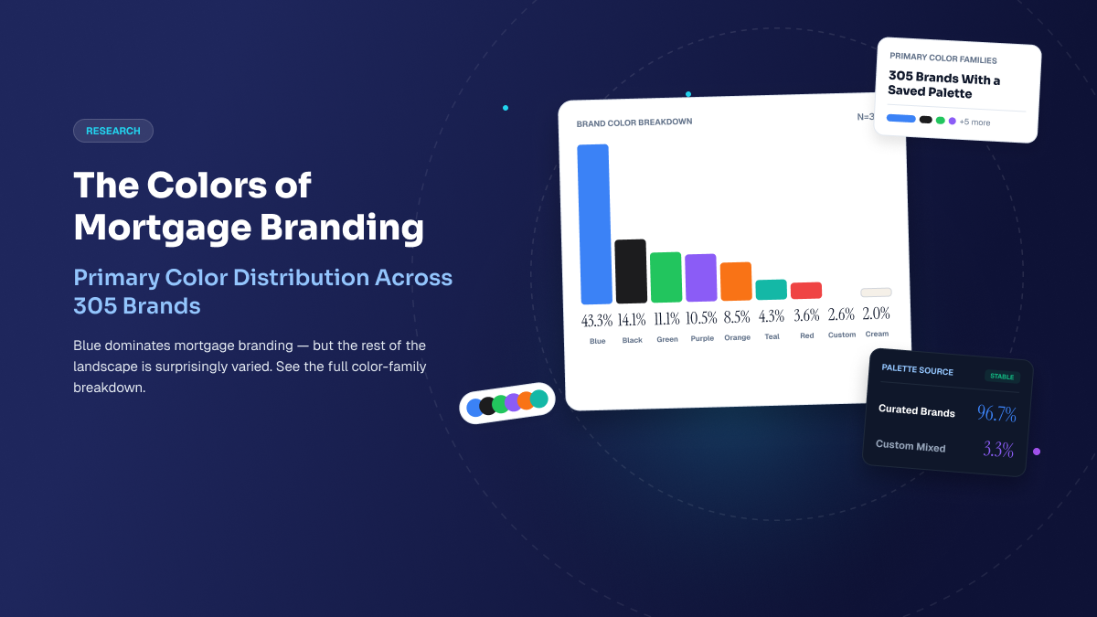
Blue was the primary color family for 43.3% of brands with a saved palette.
Black came next at 14.1%, followed by green at 11.1% and purple at 10.5%.
The choices tell us something useful about how mortgage professionals are building their brands—not necessarily why they chose a particular color, but what the resulting landscape actually looks like.
Blue is by far the most common loan officer brand color
Among brands with a saved palette, the primary color-family distribution was:
- Blue — 43.3%
- Black — 14.1%
- Green — 11.1%
- Purple — 10.5%
- Orange — 8.5%
- Teal — 4.3%
- Red — 3.6%
- Custom — 2.6%
- Cream — 2.0%
Blue isn’t just first. It was selected as the primary color family more than three times as often as black, the second-most-common choice.
That makes blue an obvious starting point for a loan officer deciding how to build a visual identity.
But it also creates an interesting branding question:
If blue is already everywhere in mortgage, is using blue the safest choice—or an opportunity to differentiate?
The answer depends on the rest of the brand.
From MLO Studio Research
Blue was the primary color family for 43.3% of the 305 mortgage-professional brands with a saved palette analyzed by MLO Studio Research.
Explore the full 2026 Loan Officer Brand Report →
Why do so many loan officers use blue?
Our data can’t answer that question.
Brand Studio records what mortgage professionals selected; it doesn’t ask users to explain the psychology behind each color decision.
So we shouldn’t conclude from this dataset that mortgage professionals chose blue because they associate it with trust, security, professionalism, or any other particular characteristic.
What we can say is that blue is deeply established in the visual landscape represented by these mortgage brands.
That has practical implications when you’re designing your own.
Using blue doesn’t mean your brand has to look generic. A pale blue paired with warm neutrals can feel very different from navy and white. A bright blue can feel very different from a muted slate. Typography, imagery, spacing, secondary colors, and tone can change the personality substantially.
The color family is only one part of the system.
Black is the second-most-common choice
14.1% of brands with a saved palette used black as their primary color family.
That’s a substantial drop from blue, but enough to make black the second-most-common choice in the data.
For a loan officer considering a darker or more minimal visual identity, that gives black a meaningful presence in the mortgage-brand landscape without approaching blue’s level of adoption.
As with blue, the execution matters.
A predominantly black brand can be paired with cream, white, muted neutrals, or a brighter accent. Typography and photography can push the result in very different directions.
The useful question isn’t simply Should my brand be black?
It’s What should someone feel when they encounter the entire brand?
Green and purple form a second tier
After blue and black, the distribution becomes much more fragmented.
Green accounted for 11.1% of brands with a saved palette.
Purple accounted for 10.5%.
Orange accounted for 8.5%.
None comes close to blue individually, but together they show that mortgage branding isn’t confined to a blue-and-black world.
For a loan officer who wants a more distinctive visual identity, these less-common color families provide room to create something recognizable while still working within a professionally designed brand system.
The key is consistency.
A distinctive color isn’t particularly useful if it appears one way on your website, another way on social media, and disappears entirely from your marketing materials.
The surprising finding: almost everyone started with a curated palette
Color family isn’t the only interesting part of the data.
Among the 305 brands with a saved palette, 96.7% used a curated palette.
Only 3.3% used a custom palette.
That’s an unusually lopsided split.
It doesn’t tell us that mortgage professionals universally prefer curated branding. These choices happened within Brand Studio, where the product itself determines which options users encounter.
But within that environment, the overwhelming majority of people who saved a palette chose one of the curated systems rather than creating a custom one.
That points to an important principle for building a loan officer brand:
You don’t necessarily need to invent a color system from scratch to make the brand yours.
Your palette doesn’t have to be unique to create a distinctive brand
There’s a tendency to treat branding as a search for something nobody else has.
A color nobody else uses.
A logo nobody has seen.
A completely original visual system.
But distinctiveness can come from the combination of choices rather than any one choice in isolation.
Two loan officers might both use blue as their primary color and still look completely different.
One could use dark navy, serif typography, architectural imagery, and restrained layouts.
Another could use brighter blue, contemporary sans-serif typography, lifestyle photography, and a more energetic content style.
Same broad color family. Very different brands.
That matters because 43.3% using blue does not mean 43.3% of brands look the same.
Imagery is where mortgage brands become more personal
The Brand Studio data becomes particularly interesting when we compare palette choices with hero imagery.
Among all 339 eligible brands, hero-image sources were:
- Curated — 43.4%
- Default — 28.6%
- User-added — 28.0%
This is a very different distribution from the palette data.
Nearly every brand with a saved palette used a curated color system, but more than one in four eligible brands added their own hero image.
That suggests the more expressive parts of a brand can vary even when the underlying design system is structured.
Color can provide consistency.
Imagery can provide personality.
What kind of imagery are loan officers choosing?
Among the named curated images, Family Home Lifestyle was the most frequently selected, appearing in approximately 10% of all eligible brands.
Other recurring imagery themes included residential settings, interiors, architecture, partnership and trust, and lifestyle.
Again, we shouldn’t infer motivations the data doesn’t contain.
But the choices themselves are useful when you’re thinking about what a mortgage website needs to communicate visually.
A loan officer doesn’t necessarily need a photograph of a house on every page simply because they work in mortgage.
The image can help communicate the broader context of the work: people, homes, relationships, lifestyle, place, or the experience of buying a home.
So what is the best color for a loan officer brand?
There isn’t one.
The data shows what’s common, not what’s universally correct.
If you’re deciding on a palette, a more useful framework is:
Choose a color system you can use consistently
Your website, social content, presentations, flyers, email assets, and other marketing should feel like they belong to the same business.
A coherent palette makes that easier.
Decide whether you want to fit the category or create more contrast
Blue is by far the most common primary color in our Brand Studio data.
That doesn’t make blue good or bad.
It means a blue brand may need other distinctive elements—typography, imagery, voice, secondary colors, layout—to become recognizable.
A less-common color may create more immediate visual differentiation, but it still has to work across the rest of the brand.
Think in systems, not individual colors
A palette is more than a hex code.
Primary and secondary colors, neutrals, typography, imagery, spacing, and repeated visual patterns all contribute to the final identity.
That’s one reason curated palettes can be useful: the colors have already been designed to function together.
Personalize the places where personality matters most
The Brand Studio data shows a striking contrast.
96.7% of brands with a saved palette used a curated palette.
But 28.0% of all eligible brands used a user-added hero image.
A structured design foundation and a personalized brand aren’t mutually exclusive.
You can standardize the underlying system while making the visible expression distinctly yours.
A good loan officer brand is more than a color palette
Color matters because it’s one of the first visual signals people encounter.
But a brand has to work beyond the first impression.
A prospective borrower might encounter your social content, visit your website, see your headshot, read your bio, use a mortgage calculator, look at your reviews, and then return weeks later when they’re ready to talk.
Those experiences should feel connected.
The goal isn’t to choose the most unusual color.
It’s to create a visual system that’s recognizable enough to become your brand—and consistent enough to remain recognizable wherever someone encounters you.
See the full research
The findings in this article come from the 2026 Loan Officer Brand Report, part of MLO Studio Research.
The full report analyzes aggregate Brand Studio choices across color families, curated and custom palettes, hero imagery, and brand creation.
Explore the 2026 Loan Officer Brand Report →
Methodology note
MLO Studio analyzed aggregate saved Brand Studio choices across 339 eligible mortgage-professional brands.
Palette findings use the 305 brands with a saved palette. Brands without a saved palette are excluded from palette calculations rather than treated as a color choice.
Hero-image findings use all 339 eligible brands because Default is a legitimate product state.
The analysis reflects current saved choices rather than the sequence or timing of historical edits. Available palettes and imagery are also determined by the Brand Studio product, so these findings should not be interpreted as a representative survey of all U.S. mortgage professionals.